Lord of the Rings Folio Society limited edition: Fellowship of the Ring
- Maurice
- Apr 30, 2022
- 4 min read

Updated: Jan 8, 2023
Tolkien has a special place in my life. When Folio Society teased their new edition several weeks ago I made sure that I acquired a set. Enough has been said about the price. I am of the opinion these are not 1 but 3 limited edition books with high production values and worth the price tag. I was very interested in the presentation of the illustrations and chapter headings. While I prefer John Howe's style over Alan Lee's, one cannot deny that Alan's Tolkien art is iconic and shaped the world in the minds of many. So for a Tolkien collector this is essential stuff.
It's a huge set, and comparable in height to other large FS limited editions like The Pilgrims Progress. The slipcase is covered in blue cloth and is illustrated on all 3 standing sides: outside and in. The outside is illustrated with a silver blocked design that runs continuously from side to side around the back. Like a mural showing important characters of the books. The inside boards are decorated with a colored illustration of a green dragon flying over rugged snow-capped mountains.


On to the books! I like the burgundy leather, but it's very susceptible to chafing so be careful when you handle the books in and out of the slipcase.
I advise to keep the protective papers that folio ships with the set. It's a minor disappointment in the quality of the leather that it happens so fast, but inevitable with any colored leather if the book is used often.


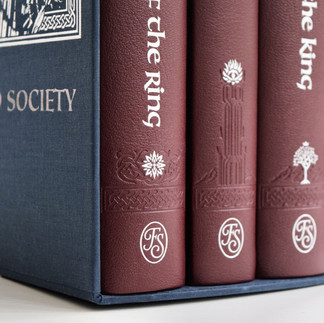


The chafing aside, the spines look stunning. The silver foil matches the burgundy leather really well. The detailed blind stamped designs on the bottom of the spines are very nicely done and highlighted with symbols that refer to each book. Feanor's star is easily recognizable on Fellowship of the Ring.


The cloth for the boards is deep dark blue and the front board is inset with an illustration of the iconic scene between Gandalf and the Balrog on the bridge of Khazad-dûm. The picture has an illustrated border which is foil blocked in silver with an intricate design. The cloth material attracts dust easily so when I unpacked the books I had to clean them with a soft cloth. The books are easy to handle in your lap and the pages are easy to turn. You open the book to the the new illustration for this edition by Alan Lee which was used for the endpapers.


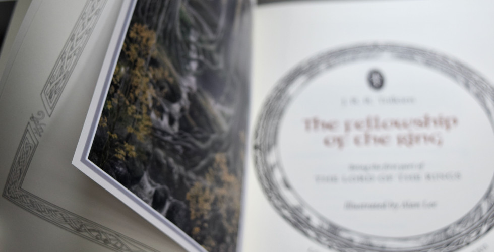
I have already lauded the Munken Pure paper in my post of Ulysses. It's thick with a fine texture and breathes quality. I also like the separator pages of which this is a picture which really showcase the paper. You can see the illustrated endpaper in the background and the thick textured paper that separates the endpaper and the title page. So we are off to a good start.

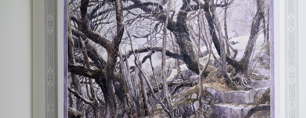
The production details, limitation number and signature are done letterpress. I like the circular design which is continued on the next title page. These kind of design choices really pull me in and show the thought that went into creating this edition. On the verso of the title page we are presented with the frontispiece.


The illustrations are tipped on plates according to fine press tradition. Bridges of Madison County from Suntup and Stardust from Lyra's Books were the first books I owned that presented the illustrations like this. It is a real elegant way of showcasing the art.


The 2 color printing in black and red should be familiar for Tolkien collectors. The burgundy red that is used in this edition for the titles and page numbers matches the quarter leather binding. The printing is sharp and I'm once again won over by Dante type. No wonder why Folio uses it for their premium limited editions. It's delicate and easy to read.
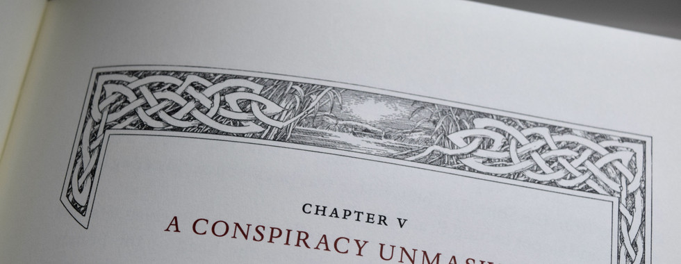
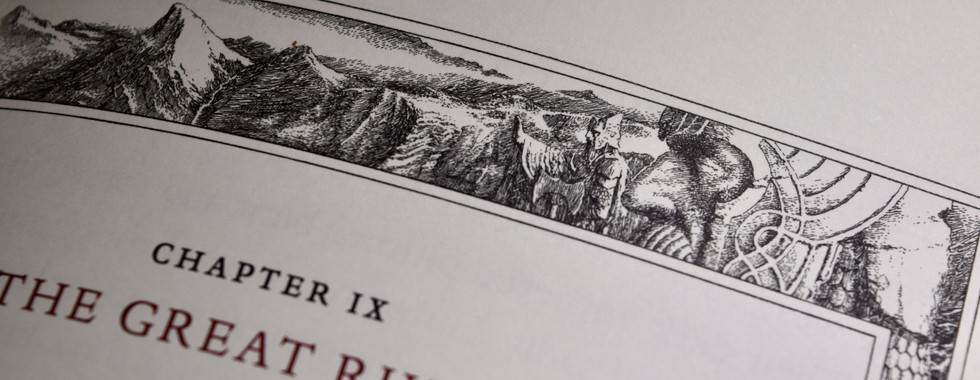
The design that I cherish most in this edition are the chapter headings. Each chapter heading has a unique themed illustration that will be instantly familiar to Tolkien readers. The amount of detail alone that went into these, is enough for me to set this edition apart from all that came before.
I photographed a selection for you to see here.


The tops are finished in silver which looks really sharp. My satin ribbon had some glue residue as you can see in the picture. While I can understand the poor binders who had to bind 3000 of these books and probably got a bit sloppy at the end of long day, it's those minor details that probably don't happen in manually checked lower limitation editions.


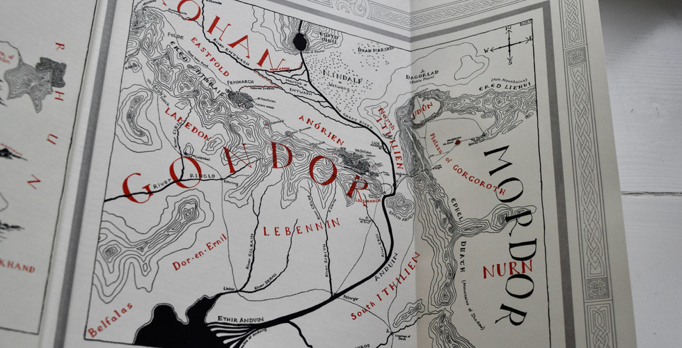
Finally, the print that comes in a Pergamenta metallic silver paper folder with a burgundy red ring design is an illustration of Minas Tirith. it complements the overall design very well. This is also true for the fold out map. I am really glad they did not make fold out maps in the books. I'm not a fan of fold out illustrations or maps in books so I am glad this is a complete separate piece and it's really well done. It's housed in a folder covered in burgundy red cloth with silver blocked type. I'll let the photos speak for themselves.


Folio Society did right by Lord of the Rings with this limited edition in my book. I hope you are 1 of the 999 others who own a set. You now own a piece of Lord the Rings history with Alan Lee's definitive edition. Now I can start a petition for Lyra's Press to make John Howe's definitive edition. Stay healthy and keep reading.


Comments